24 October, 2023
adminNON
0 Comments
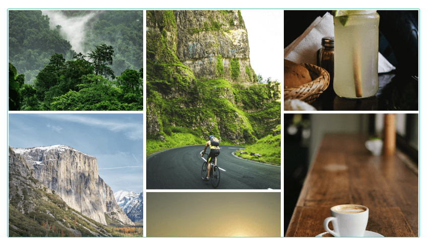
วิธีสร้าง responsive photo grid โดยใช้ CSS โดยตัวอย่าง Google Images เป็นตัวอย่างของแกลเลอรีตารางรูปภาพresponsive photo grid พร้อมตัวอย่างแบบเต็มเมื่อแตะ ต่อไปนี้เป็นวิธีสร้างโดยใช้ flexbox ใน CSS พร้อมโค้ดเต็มระบบ ใช้งานง่ายมาก
HTML:
1 2 3 4 5 6 7 8 9 10 11 12 13 14 15 16 17 18 19 20 21 22 23 24 25 26 27 28 29 30 31 32 33 34 | <div class="gallery"> <div class="column"> <img src="https://source.unsplash.com/random/800x600/?jungle"/> <img src="https://source.unsplash.com/random/600x800/?mountain"/> <img src="https://source.unsplash.com/random/800x600/?beach"/> <img src="https://source.unsplash.com/random/600x800/?forest"/> <img src="https://source.unsplash.com/random/800x600/?desert"/> <img src="https://source.unsplash.com/random/600x800/?pond"/> </div> <div class="column"> <img src="https://source.unsplash.com/random/600x800/?bicycle"/> <img src="https://source.unsplash.com/random/800x600/?airballon"/> <img src="https://source.unsplash.com/random/600x800/?skate"/> <img src="https://source.unsplash.com/random/800x600/?scooter"/> <img src="https://source.unsplash.com/random/600x800/?moto"/> <img src="https://source.unsplash.com/random/800x600/?car"/> </div> <div class="column"> <img src="https://source.unsplash.com/random/800x600/?lemonade"/> <img src="https://source.unsplash.com/random/600x800/?coffee"/> <img src="https://source.unsplash.com/random/800x600/?water"/> <img src="https://source.unsplash.com/random/600x800/?wine"/> <img src="https://source.unsplash.com/random/800x600/?juice"/> <img src="https://source.unsplash.com/random/600x800/?beer"/> </div> <div class="column"> <img src="https://source.unsplash.com/random/600x800/?office"/> <img src="https://source.unsplash.com/random/800x600/?bar"/> <img src="https://source.unsplash.com/random/600x800/?garage"/> <img src="https://source.unsplash.com/random/800x600/?house"/> <img src="https://source.unsplash.com/random/600x800/?camping"/> <img src="https://source.unsplash.com/random/800x600/?store"/> </div></div> |
CSS:
1 2 3 4 5 6 7 8 9 10 11 12 13 14 15 16 17 18 19 20 21 22 23 24 25 26 27 28 29 30 31 32 33 34 35 36 37 38 39 40 41 42 43 44 45 46 47 48 49 50 51 52 53 54 55 56 57 58 59 60 61 62 63 64 65 66 67 68 69 70 71 72 73 74 75 76 77 78 79 80 81 82 83 84 | * { box-sizing: border-box; transition: all 0.125s ease 0s;}body { margin: 0; padding: 0; background: #fff;}body:before, body:after { content: "IMAGES FROM UNSPLASH.COM"; position: absolute; top: 0px; color: #00000000; left: 50%; transform: translateX(-50%); text-shadow: 0 -1px 1px #000000ab, 0 1px 1px #ffffff82; font-family: Arial, serif; padding: 2px 10px; border-radius: 2px; font-size: 9px; display: flex; align-items: flex-end; line-height: 14px;}body:after { top: inherit; bottom: 0; position: relative; margin-top: -12px; transform: translateX(-100%); margin-left: 90px; width: 150px;}img { width: 100%;}.gallery { display: flex; padding: 5px; flex-wrap: wrap;}.column { flex: 25%; padding: 5px;}.column img { margin-top: 5px; cursor: pointer;}.column img:active { height: auto; width: auto; max-width: 80%; position: fixed; left: 50%; top: 50%; border: 10px solid #fff; margin: 0px; box-shadow: 0 0 1000px 1000px #fff8; transform: translateX(-50%) translateY(-50%);}@media (max-width: 768px) { .column { flex: 50%; }}@media (max-width: 500px) { .column { flex: 100%; }} |
Live Demo